RiConnect, Inc. has unveiled its new Check App icon—demonstrating an unwavering commitment to elevating global safety compliance standards at the point of use. This move signals the company's strong commitment to enhancing the user experience for field operators and strengthening global safety compliance standards. Developed specifically for Pre-Use Checks and Maintenance Checks workflows, the new icon not only establishes brand visual consistency but also clearly communicates the critical message of safety and compliance.
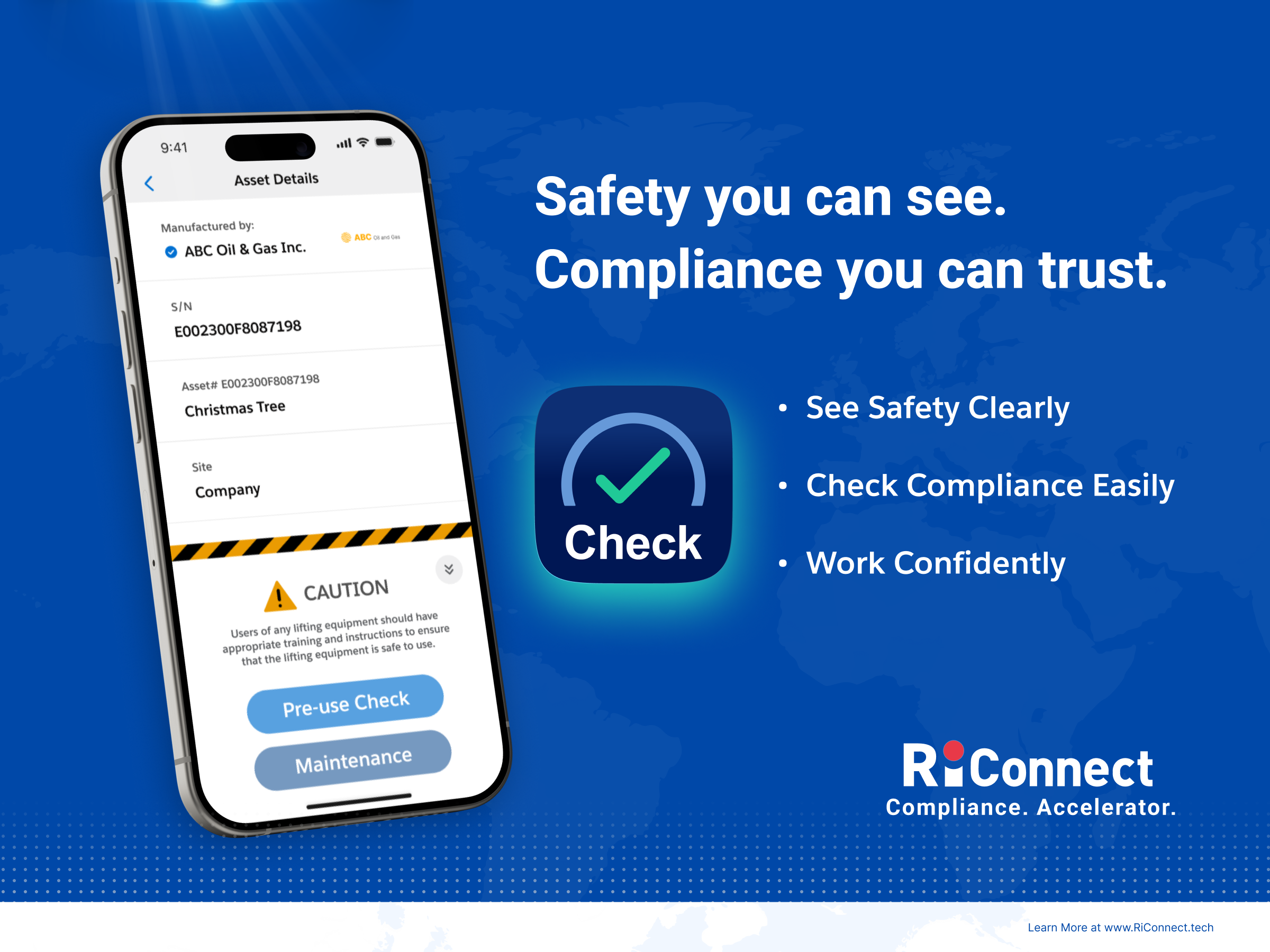
The new icon features a deep blue gradient background paired with a core green check (tick) mark. The green check mark is established as a direct visual cue for task completion and safety approval. The surrounding semi-circle design symbolizes the "continuous cycle of daily checks," echoing the core principle of safety management emphasized by international regulatory frameworks—e.g. the UK’s Health and Safety Executive (HSE) and U.S.’s Occupational Safety and Health Administration (OSHA)—that compliance is an ongoing commitment requiring systematic, daily implementation.
This design ensures field operators can immediately grasp its meaning, as it accurately reflects their existing workflows and regulatory obligations. In global industrial environments, green is the universal language for “safety clearance.” This color-coded communication transcends language barriers, enabling operators to instinctively associate the symbol with a verified safe status and completed compliance tasks.
RiConnect serves a diverse client base spanning Europe, Asia, and the Middle East, with operations in industries ranging from manufacturing and renewable energy to oil and gas, maritime services, and heavy industry. In such broad and varied markets, visual communication must possess a high degree of universality.
The green check mark serves as a universal, culturally neutral symbol that successfully communicates the message of “task completed” and “safety confirmed” without the need for translation or interpretation. Regardless of the region, the application icon's meaning remains consistent and immediately clear to every operator. This universality perfectly aligns with RiConnect's vision to create a truly borderless compliance ecosystem.
RiConnect is highly knowledgeable about the challenges faced by field operators in high-pressure industrial environments, which require multitasking, time constraints, and elevated safety focus. The Check App icon's design is a direct response to these realities.
The inclusion of the word “Check” on the icon provides redundant confirmation of the application’s purpose, eliminating any potential confusion as operators quickly scan their device screens. This dual-layer communication—visual symbol paired with text label—reflects a profound insight into user behavior patterns in high-stress industrial settings.
Furthermore, the blue gradient background conveys qualities essential for managing safety-critical operations: trust, stability, and professional reliability.
The new Check App icon is more than just a visual update; it represents RiConnect's ongoing mission to accelerate digital compliance transformation.
In line with its core promise and tagline as the “Compliance. Accelerator.”, the icon provides field operators with a simple, reliable, and instantly recognizable mark of trust. This update reflects RiConnect's attention to detail, commitment to the user experience, and dedication to developing compliance technology that operates seamlessly in demanding, safety-first environments. The launch of the Check App icon marks a critical step in RiConnect's journey to transition compliance from a mere obligation into an integrated operational practice.